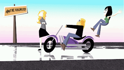
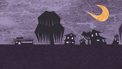
A recent illustration of the view of my apartment I get to see every morning and evening from the bust stop.
It's a little dull, I had a hard time making it interesting, compositionally, but there it is. I had The Night Window by Edward Hopper in mind as I worked on it, which no coincidence since a copy of it is hanging in my living room.
Saturday, December 11, 2010
Tuesday, December 7, 2010
Integrity Health Animation
I recently finished an animation for Integrity Health in conjunction with the fine folks at Princeton Partners. You can watch here.
Here are a few stills:
Some production art:
 |
| storyboard sketch of the above still. |
 |
| An abandoned concept. I have to admit, wrestling would have been fun to animate. |
From Sketch to Final:  |
| The storyboard sketch. |
 | |
|
 |
| Simple color always is the way to go, but... |
 |
| ...it couldn't be all dudes. |
Ceiva Animation.
I had the pleasure of help editing and animating some text for Ceiva with Jim's Journal's Scott Dikkers. Watch it here.
Saturday, December 4, 2010
The Conversation - Alternate Ending
A school editing project. I removed all of the sound and replaced it.
The Conversation - Alternate Ending from Brett Underhill on Vimeo.
The Conversation - Alternate Ending from Brett Underhill on Vimeo.
Monday, November 15, 2010
Production art & self-indulgent commentary: "Ok, the Allman Brothers"
Here are a few stills and production art from my recent Allman Brothers animation. Most of the artwork looks best in motion, but some of them stand nicely on their own. Actually, it was a lot of work and I feel like being self-indulgent right now. Isn't that what blogs are for?
A lot of the production art I did is pretty rough, I did most of the illustrating on the computer. Since this was my own project, I didn't have to produce story boards that were in any way legible to any one other than me. (I was also on the beach in Barcelona at the time, having just finished the initial audio edits and listening to it on my ipod while I scribbled down ideas - nothing like working on the beach next to some of Europe's finest). They say good animation begins with a great drawing - hopefully the final product rose above my general blocking and initial staging for the piece, because the first animatic was a lot of this:


After staging and boarding everything, I began to get a little more specific with designs, like figuring out the logistics and look of the opening shot. A lot of what is in this early sketch of the band ended up in the final piece. The color palettes for each era were all very intentional (as you can see detailed in the corner), I made a color script which appears during the credits (and was posted on this blog ). The 1971 era colors are washed out blues and browns, similar to the grainy Fillmore East footage that is in circulation; the 1973 band is yellowish brown, similar to the gatefold of the Wipe the Windows and Brothers & Sisters and that era in general; the 1994 era is bright primary colors, similar to their album art, Where It All Begins in particular; the 2003 era band is a little more jazzy so I used more cool colors.
COLOR STUDIES:
 |
| A fiery Duane, similar to this one. |
 |
| Dickey Betts on fire, apparently. |
 |
| A Gregg color study. |
 |
| A quick study of young Gregg at the keys. |
 |
| Dickey through the years |
 |
| a few studies of Warren throughout the years. |
and Allen Woody, of course. Unfortunately I couldn't really find places to fit him in to the animation much, but that mirrored his presence in the band since he was often in the background behind Warren and Dickey, in spite of his monstrous bass.

A quick style frame to see how things were shaping up. This is kind of Frank Miller-ish.

I illustrated the players right on top of each other so they would seamlessly change over the course of the song (and the passage of time).
STILLS:
Duane in his peacock shirt (later seen on Gregg)
Dickey, similar to his appearance inside Wipe the Windows. I initially wasn't going to feature the 1973 era of the band (largely because I didn't have a decent recording of "Statesboro Blues" from that era) but I just couldn't leave out Chuck & Lamar and the most commercially successful era of the band. Plus it gave me more chance to feature Dickey.
I have illustrated Derek for his own band's t-shirts, and the problem was always coming up with new ways to stage the same players. That's probably the main reason I began to animate all of the iconography. That, and animating guitars is really, really boring.
I was a little worried that Gregg would be too prominently featured, but then again, he's the one singing the song in each era.
 |
| One of four quick passes of Gregg singing in the spotlight. |
Instead of animating the action on stage, I decided to have some fun with their iconography, similar to segments from The Beatles' Yellow Submarine (the peach truck zooming around in the background was definitely inspired by the sub) and "Free as a Bird" video. Here's a quick look at some of the first storyboards I did of the sequence.
 |
| Initially I had Gregg land at "High Falls", continuing his 'high fall' from the "Dreams" mountain, but scrapped the idea. |
Here is "Sister Lucille", a little more fun than her sister. The background is based on the cover to Seven Turns. When trying to find an aesthetic, I went with what was already familiar and provided by the band.
Here is a nod to "Dreams" (and "Mountain Jam" too I suppose). I tried to match the action to the era of the audio, and kept it familiar, so Gregg is decked out in his digs from the first album's photos. This also echoes George Harrison's introduction in Yellow Submarine.
Rose Hill, populated late at night by "Liz Reed", Dickey. After this shot, Duane is leaning on Little Martha (pose references the bathroom shot that appears on the back of Duane Allman Anthology II) and Berry is posed as Jesus as was on The Allman Brothers Band. I was a little worried people would think they were ghosts, but it's a graveyard song-writing frenzy.

The Midnight Rider, flipping his last silver dollar.
Here's an early sketch of Jimmy working at the commerce bank. I eventually hippied him up a little bit, he kept his pony tail for partying, but still jumps into the monkey suit for his legit gig.

The rain and moon glow was added later to this "sleepy southern town" while "the midnight moon burns brightly".
Here's an example of my rough sketching process. Here's the initial staging I did for a woman beckoned into someone's kitchen while it's raining outdoors. I don't think this was very successful, most people thought it was a reference to "One Way Out", which is one of the few major songs I did not reference. (I later thought I could have use a "One Way" sign in a transition or during the credits.)

Here's the more detailed sketch to illustrate over.

and the final illustration before the rain was added.

I took 2 separate covers from 20 years apart and combined them. I think it made a good thematic marriage, not just because they both have a swamp, but because Duane is pretty much "where it all began" for this band.


Another cover re-imagining in the animation's style, Brothers & Sisters. Vaylor Trucks, the tyke pictured on the cover, was one of the first people to let me know the animation wasn't a complete waste of time.

This one seemed obvious, I knew this would end the piece. One of my favorite Allman Brothers' covers and it isn't even in print anymore.

I think altogether I fit in 15 song references, 10 album references, and another 4 or 5 places or items in the piece. Maybe I should hold a contest to see if anyone can find them all.
If you read all of this, I'm amazed - you must have more time on your hands than I do, because this blog has more information on this piece than Coppolla yielded for The Godfather Trilogy and Apocalypse Now combined. Ok, that's enough self-indulging for now.
Sunday, October 24, 2010
Adam & Lu
My brother, Adam, took a bus down the street to the justice of the peace last July and married Luciana. Great day, they are pretty damned happy. Here is the two of them in their public chariot.
Friday, October 15, 2010
Pacer ad
I recently completed this flash banner for Pacer Intermodal:
Below are three style frames as the style itself was hammered out:
This is a frame the agency gave me from their animatic:

I tried to give the blue ghost some personality, while retaining his blueness but this was deemed too modern:
Take II was on the right track, but still deemed too modern and angular.
Take III was just right, but I still prefer the first one.
Subscribe to:
Comments (Atom)


